Property Tax Appeal
Webscraping with Python and Analysis with R
Overview
I wanted to appeal my property taxes because I thought they were high, but I didn't know where I stood compared to my neighbors. Wouldn't it would be great if I could see the property taxes for all homes in my neighborhood? Webscraping to the rescue!
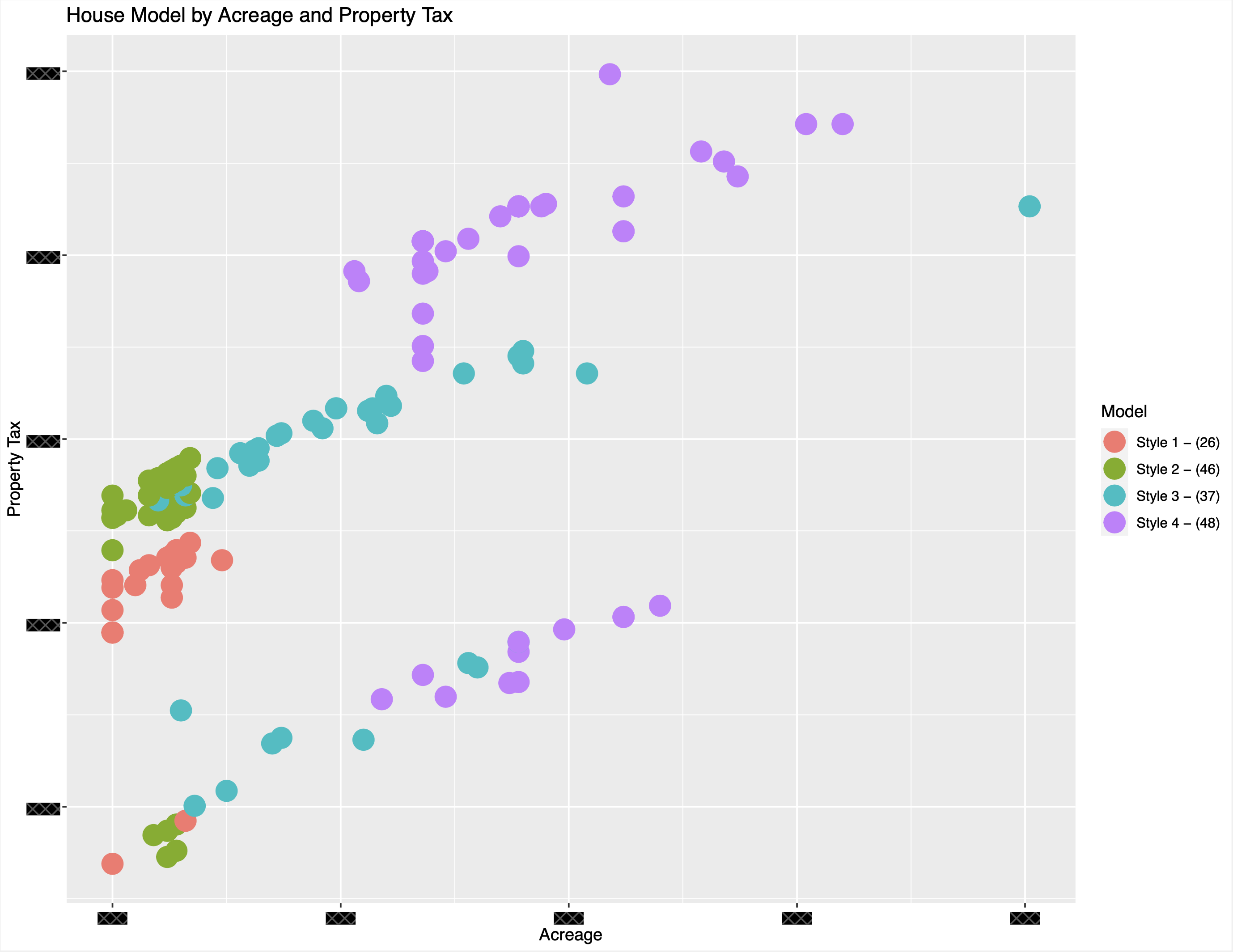
In terms of ease of analysis, this was one of the rare occasion where it is good to live in a "cookie cutter" neighborhood as there are only 4 house styles on similar acreages. Looking at the graph above, there are clear factors impacting the property tax. As the acreage goes up, so does the property tax and the larger houses (Style 3 and Style 4) also have higher taxes which all make logical sense. However, it appears that there are 2 distinct lines, one for those who have appealed their taxes and those who have not. Also of note, I have redacted the actual dollar amount and other details to not disclose sensitive information, however the graphs still demonstrate the conclusions drawn during this analysis.
Webscraping with Python

To perform the webscraping in Python, I used the Selenium and BeautifulSoup modules. To format the data, I used Pandas and then extracted it to a csv file. The first stage of the code established the column names and populated the first address into the dataframe. The second stage then iterated through the numerical street address and added each to the dataframe. Another fortunate coincidence is that 90% of the houses in my neighborhood are on one long street and the other 10% on just one other, therefore it was simple enough to just run the program twice, once for each street name and sequence of numerical street addresses.
Data Analysis with R
Once I had the raw data in a csv file I needed to decide how I would analyze the data. I use R in my work and find it is the fastest way to generate presentation worthy graphs. For this analysis in R, I used tidyverse and ggplot to generate the graphs presented here and in the introduction.
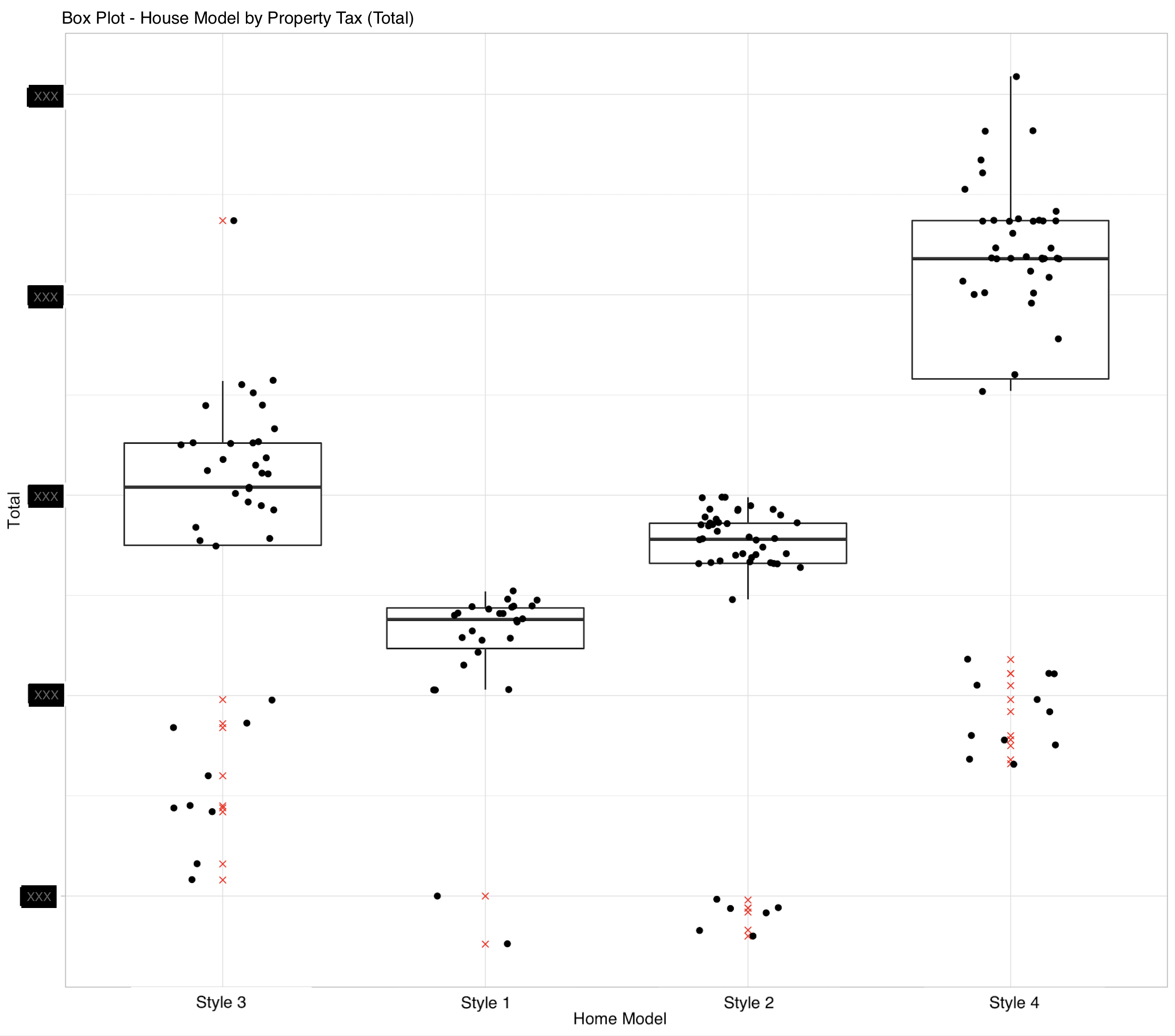
The assumptions used in this analysis is that the square footage of a house, and the acreage that house sits on are the two main factors considered in setting the property tax. Diving into the first graph, out of the 157 houses included in this analysis, it was concluded that the lower line on the first graph (28 houses) represents those who have appealed to reduce their property taxes because the same house model (same or similar square footage) on similar acreage have vastly different property taxes compared to the top line (129 houses). Therefore there is significant reduction potential for those who have yet to appeal. From the second graph, the box plot shows that the outliers are almost exclusively on the lower end. This made the risk of having my taxes increased low and the probabilty of successfully reducing my taxes high with the reduction amount being significant.
Conclusions
For the appeal, I had to provide three other comparable houses to justify my appeal. Using this data, I selected 3 house of the same model that paid the lowest amount. This was very successful as my taxes were reduced significantly.